
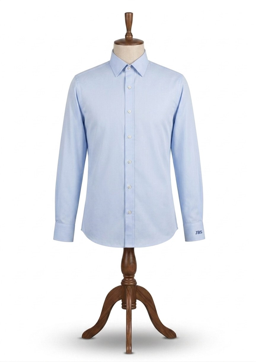
A monogram is not decoration. It is a label, in the oldest sense. Two or three letters embroidered on the cuff, the breast pocket or just under the collar point, in a thread that sits cleanly against the cloth, telling anyone who notices that this shirt was made for one man and nobody else. It is a small decision and one of the more satisfying ones in the whole commission. We monogram any shirt we make, in a choice of lettering styles that we will show you when you come in, and we will tell you if the one you have picked is going to look fussy.
Where it goes, how it looks, what colour thread
Placement comes down to taste and a bit of tradition. Most people take it on the left cuff, where it shows when the jacket sleeve rides back, just above the link. The breast pocket is the other common spot. Some prefer it lower down on the body, under the collar point, where it appears only when the shirt is worn open at the neck. We will suggest a position based on the style of shirt and how you actually wear it, and if you want it somewhere unusual, say so.
For the lettering you can go from a plain clean block letter to a proper intertwined script, and everything in between. We keep reference examples of the lot, so you can look at them rather than imagine them. Thread is either the same colour as the cloth, white on white being the classic, which catches the light and announces nothing, or a contrast such as navy on white or burgundy on blue, which makes it visible across a table. Neither is more correct than the other. It is entirely your call.